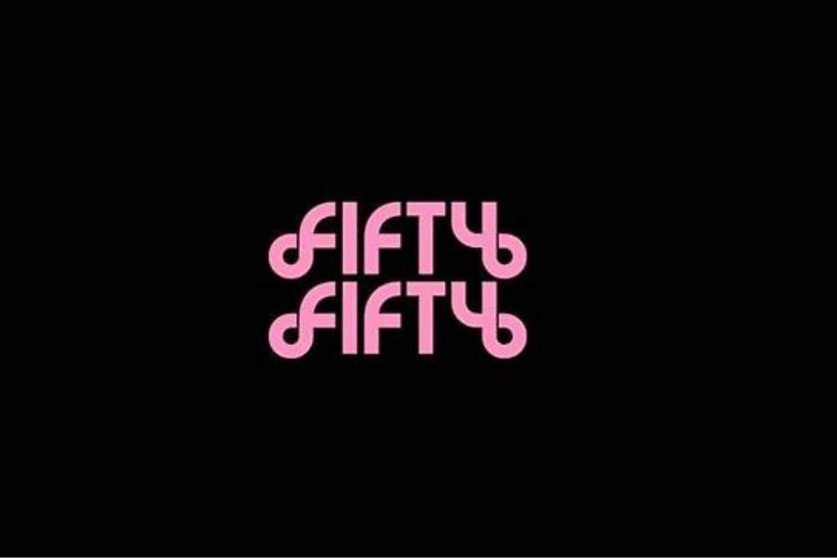
According to the agency ATTRAKT on August 5th, FIFTY FIFTY released their new logo motion at midnight through their official YouTube channel. The logo features pink hues and geometric elements that resemble patterns, in contrast to their previous bold, black-and-white linear logo.
The logo starts with a circular shape that transforms into various geometric figures, each rotating with its own distinct style. After a few rearrangements, the elements reconnect to form the name “FIFTY FIFTY”. This represents the group’s journey of coming back together after a period of separation due to past events.
While the previous logo highlighted the literal meaning of “FIFTY FIFTY” through its black-and-white design, the new logo places greater emphasis on expressing the group’s color and identity.
ATTRAKT stated that they will gradually release various content leading up to FIFTY FIFTY’s comeback. Following the silhouette video teaser and the new logo, upcoming content is expected to further heighten anticipation for the group’s return.
FIFTY FIFTY made a remarkable achievement with their first single “The Beginning: Cupid”, released on February 24th last year, as its title track “Cupid” entered the U.S. Billboard Hot 100 chart at No.100 just 130 days after debut. The song eventually reached as high as No.17 and set a record for the longest-charting K-pop girl group on the chart with a 25-week run.
However, the group’s activities were halted when the four members filed for an injunction to suspend their exclusive contracts with ATTRAKT. The court rejected the request, even on appeal. Among the members, Keena was the only one to withdraw her appeal and return to ATTRAKT.
Following this, ATTRAKT restructured the group around Keena, recruiting four new members in April. They are set to release a new album in September.
You must be logged in to post a comment.