At midnight on January 27, BABYMONSTER’s character posters for the group’s upcoming single, “Stuck in The Middle”, were published on their official SNS channels.
Immediately after, a topic regarding these posters was published on the Korean forum “theqoo”, drawing huge attention.
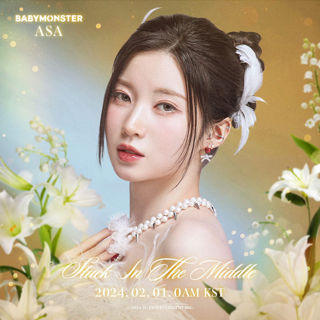
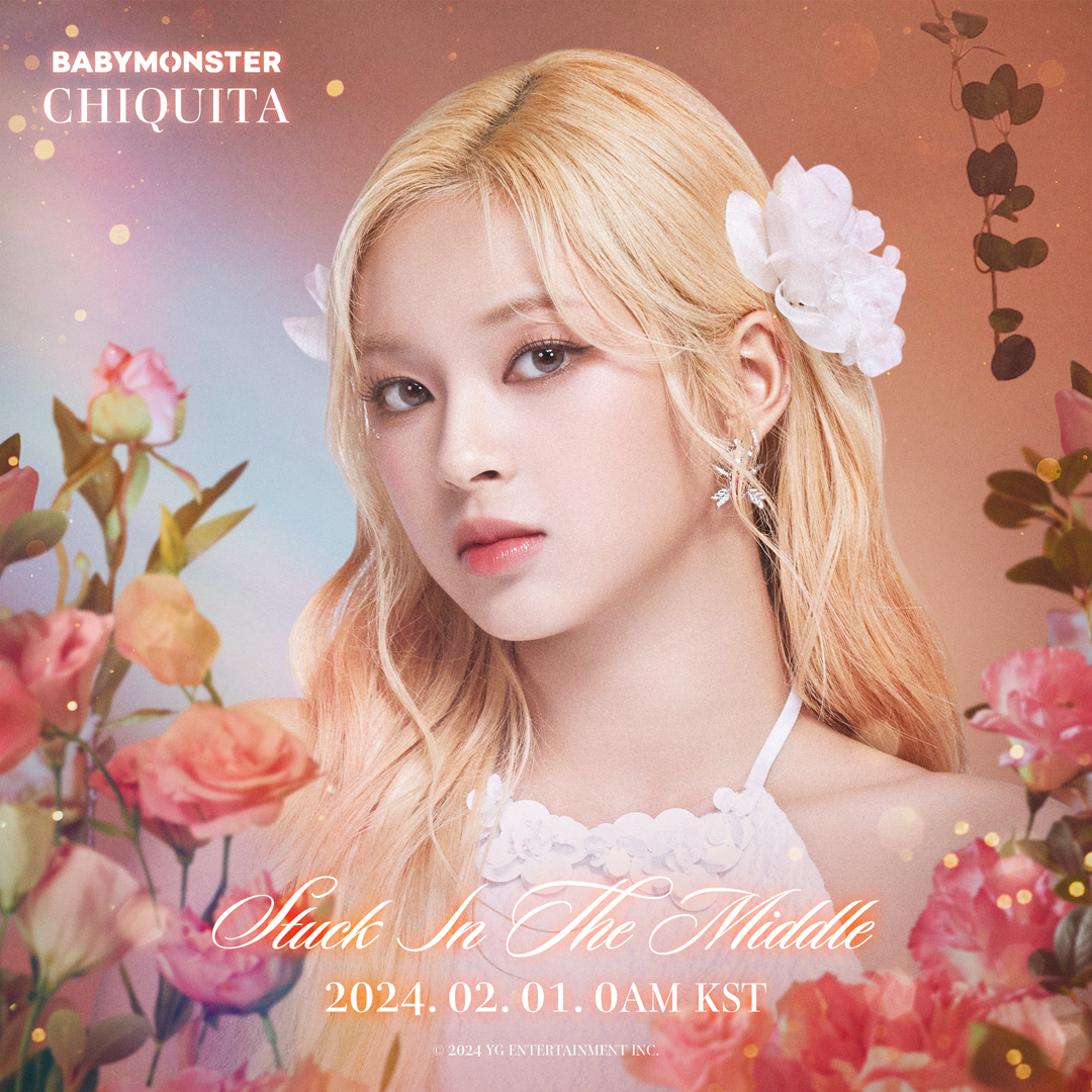
According to netizens, while tackling a new concept never seen before in YG and boasting the members’ outstanding visuals, BABYMONSTER’s Posters for “Stuck in The Middle” are simply disappointing. The design and typography looks like the posters were done in the early 2010s instead of 2024.
Below are some comments from netizens:
- Were these posters created by a person who just got into Photoshop in the early 2010s?
- These are so tacky… Yang Hyun-suk’s sense is stuck in the past
- Why did the posters end up like this… Has the entire design team left the company? Even if they were outsourced, which director allowed this?? YG is truly screwed now
- These are so old-fashioned it’s creepy. YG’s sense of aesthetics must be really wacky
- This is not an idol comeback poster. They look like an ad for cosmetics for older women.
- Yang Hyun-suk needs to be stopped.
Source: theqoo
You must be logged in to post a comment.